Loading project content...
tolá market
A marketplace for shopping responsibly, selling products in returnable containers
View live projectA marketplace for shopping responsibly, selling products in returnable containers
View live projectLoading project content...
Since this project is no longer maintained, the actual project page (when clicking the button on the top of the page) may have unexpected behaviors, however, it still serves to illustrate some of the work done.
Tolá Market was a marketplace for shopping more responsibly. It was a project I founded in 2019 that lasted about five and a half years.
We sold and delivered food and products for personal and home use in returnable containers, and we ensured that those containers remained part of the consumption cycle for a longer time, leading to a lot less waste generation.
We not only received orders through our marketplace, we also processed them and delivered them to our customer's home doors. That meant that we had to take care of stock, inventory and last-mile delivery logistics; all that came with their own challenges, however, the following content is just focused on the web application.
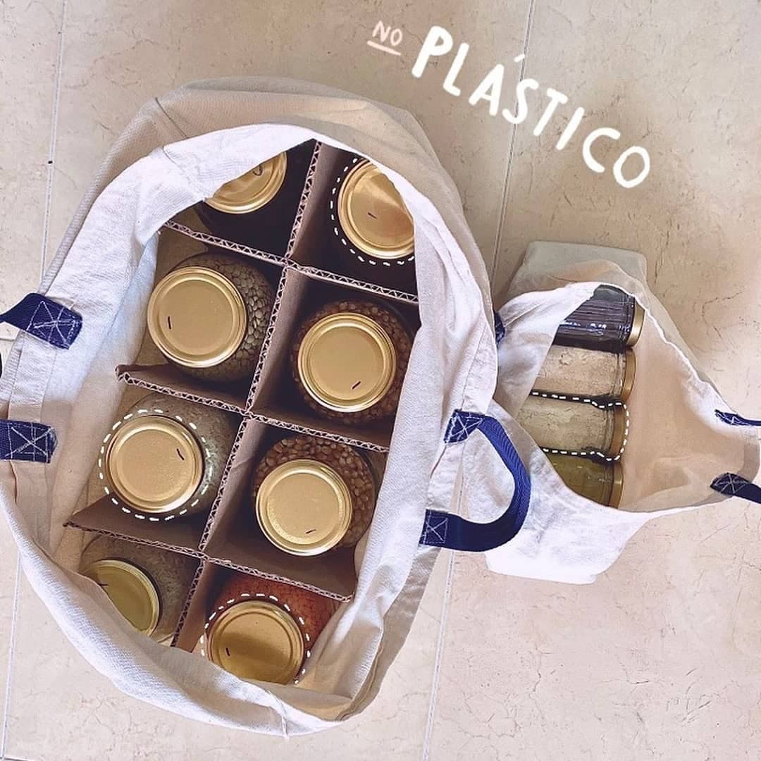
This is how we delivered our orders: the products in their containers (made out of glass, most of the time), and the containers inside a returnable cloth bag.
If the customer included the containers in the order, they could keep them, otherwise they had to return them empty when receiving the order.
A typical online marketplace takes care of selling products and delivering them to the customer, but we were not a typical marketplace.
These were some of the challenges we faced along the journey:
Clearly communicating the returnable container process:
We sold most of our products in returnable containers, so the containers had to eventually come back to us. Since this concept was unfamiliar to most, it was essential to clearly communicate how the process worked at every step of the buying journey.
Miscommunication could lead to confusion, reduced compliance, or frustration, so we prioritized transparency and simplicity in our messaging across the website, order confirmations, and customer support interactions.
Ensuring seamless operational coordination One of the biggest challenges was the ability to be on time for the delivery. We had to function like clockwork. Each stage of the buying process was tightly interconnected, and any delays or missteps in one could create a domino effect, potentially disrupting the entire operation.
Automation was key to make everything work smoothly, we were able to integrate our web application with the other tools (many of them developed by us) we used to manage our operations.
Developing custom functionality for a unique marketplace
As a non-traditional marketplace, we couldn't rely solely on generic solutions. Instead, we had to design and develop numerous custom features tailored to our unique business model. From managing returnable containers to calculating the rate shipping price for each order.
This challenge pushed us to think creatively and build solutions that aligned with our mission, setting our marketplace apart from the competition.
Maintaining website performance and updates
As the central hub of our marketplace, any downtime could directly impact sales and customer trust.
Balancing these updates with daily operations required careful planning and testing to minimize downtime and ensure a smooth experience for both customers and the operations team. The website went down a few times a few minutes due to improperly addressed software updates. However, we learned over time and we were able to set up a detailed process for handling updates safely.
The web application was where most of the transactions happened between our customers and us, so it was one of the main points of attention when it came to improving our service.
Around 70% of our first-time visitors were using the website from their phones, and around 60% of our customers made their orders from a desktop device, so we always made sure that the website was easy to use and performant across all devices.
We developed different features for the web application in three main areas: products, checkout, and blog.
As you might expect, the product pages were where our customers spent most of their time when they were visiting us.
This section dives into details of some of the key features of the product pages.
This was one of the earliest features at the beginning and it was leveraged by a WordPress plugin (more about the tech stack later), however, that presented limitations when it came to customizing the quick view modal. So we transitioned to a custom solution using the native HTML dialog element, which was a lighter approach. We even set up a reusable component for different dialog elements across the website.
This is a video of the product quick view feature in action:
With this, the user didn't have to stop browsing the product catalog to go to the product page and add the product to the cart.
Most of the products had different variations, and the customer could include the container in which they were going to receive the product if they wanted. That gave lots of prices variation for one single product, so we made sure to display accurate price ranges that only referred to the actual product, excluding container prices.
This was especially important because one of the main aspects we had to compete for with other marketplaces was price, so we had to make it easy for customers to compare our prices with others.
So for a given product (almonds, in this example), we could have these many prices:
| Quantity sold (g) | Type of container | Price per gram | Included in price range |
|---|---|---|---|
| 200 | No container | 61.5 | Yes |
| 200 | Jar container | 86.5 | No |
| 200 | Paper bag | 65.5 | No |
| 400 | No container | 59.5 | No |
| 400 | Jar container | 72 | No |
| 400 | Paper bag | 61.5 | No |
| 590 | No container | 57.8 | Yes |
| 590 | Jar container | 66.3 | No |
| 590 | Paper bag | 59.5 | No |
For this example, the actual price range would be from $57.8 to $61.5 per gram. And this is how it would be displayed in the archive pages:
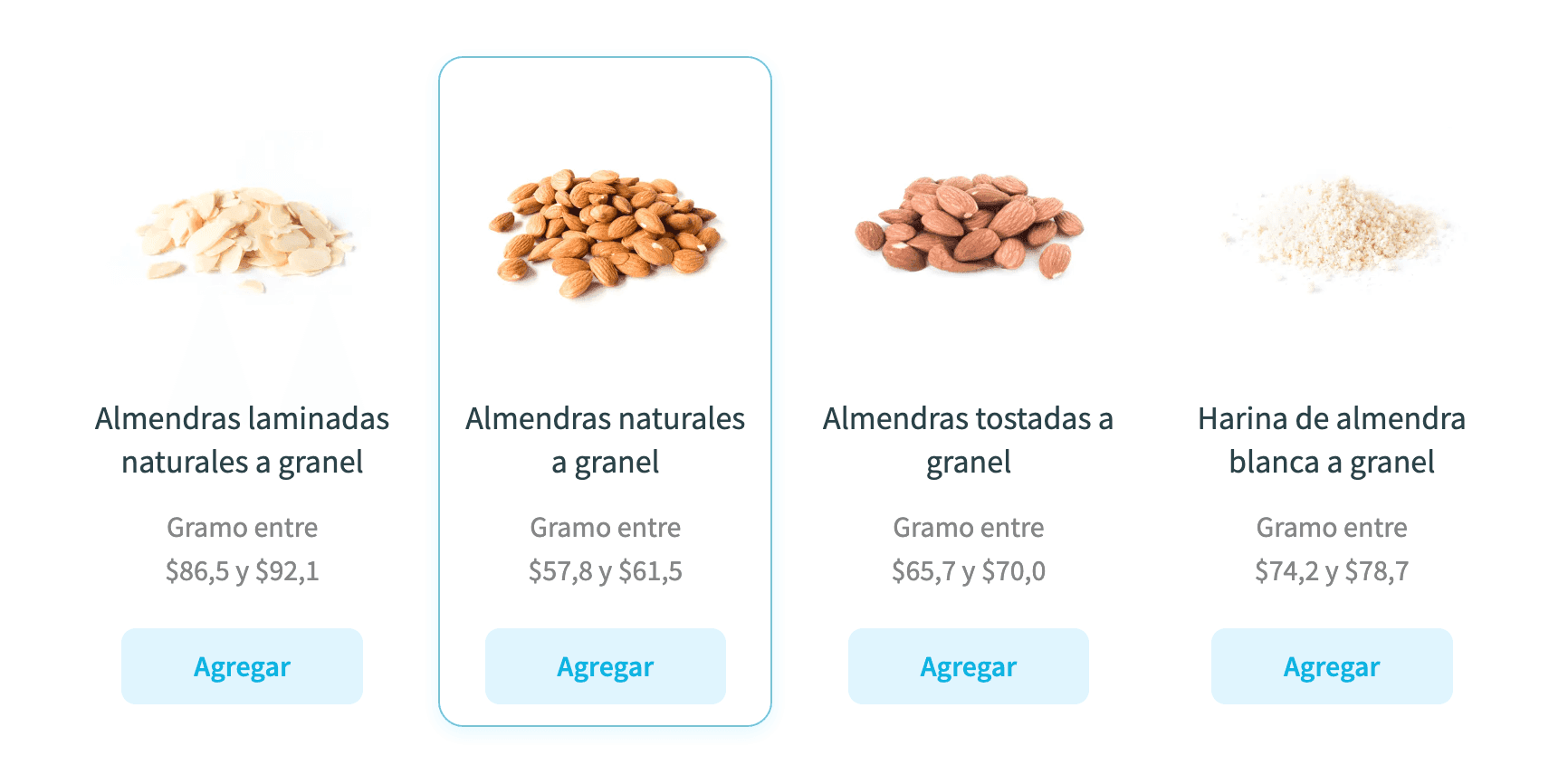
Products with price range displayed on the archive page
It would have been too easy if all products were as this one, but some products were simple products (only had one price, but we would have to still display the price per unit), or were not sold with variable quantities, or variable containers, or the quantity unit of measure was different (it could be grams or milliliters or units). All of that added complexity to the development of this feature.
We had over 180 different products in our marketplace and always had pretty good organic traffic from search engines, all that thanks (in big part) to the content that was presented on page, which included:
Conversions table:
Most of the foot products were sold in grams, so the conversion table presented the equivalent of each product quantity in volume. This was important to help the customer understand how much of the product they were buying.
This was automatically calculated based on the density of the product and the quantities available for sale.
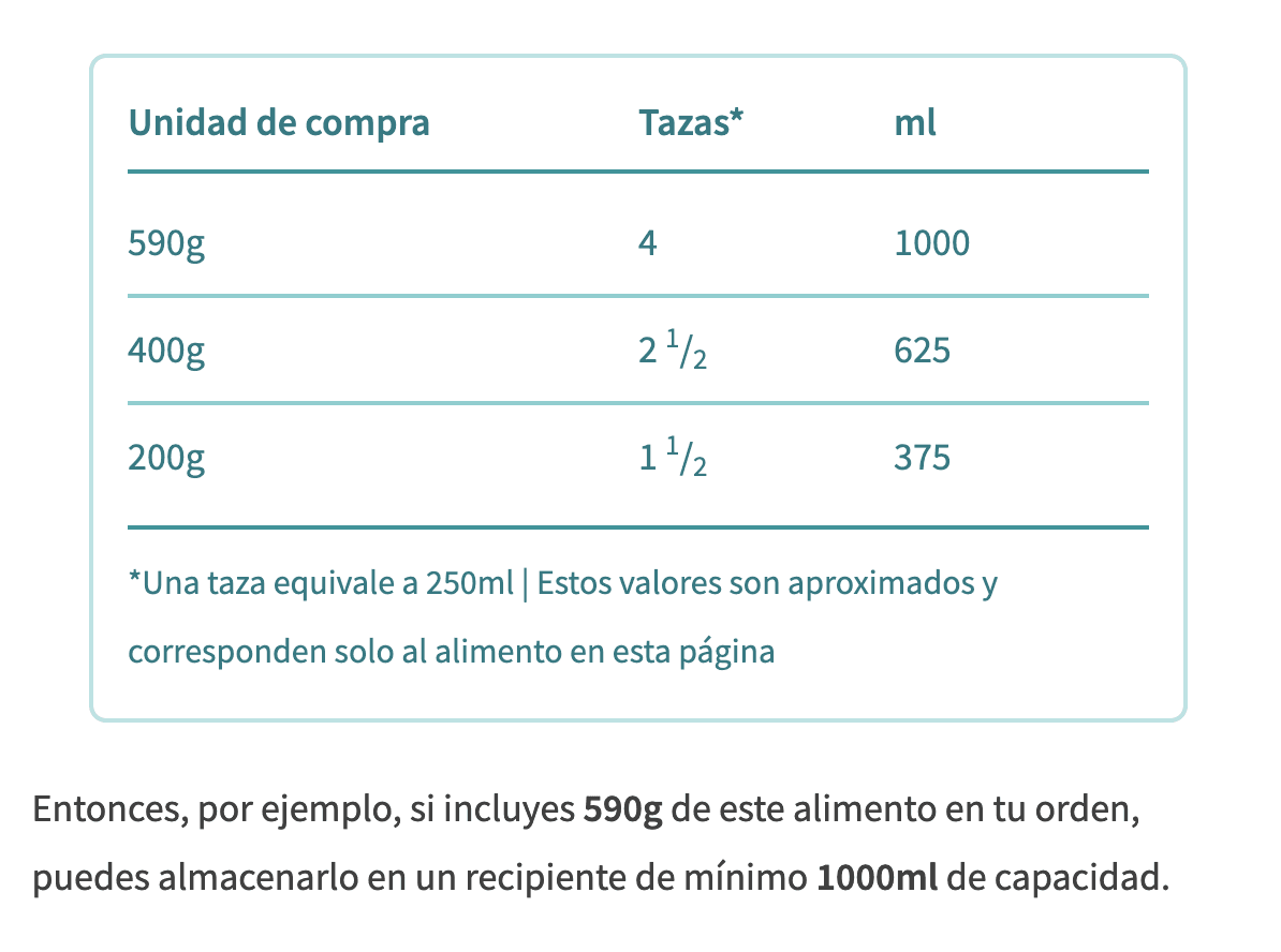
Nutritional information:
We not only developed a way to set up the nutritional information from the administrator but also the amino acids profile.
Additionally, we also displayed information such as product origin, ingredients and allergens, how to use and preserve the product, and how to dispose waste after the product has been used.
We were able to set up all this additional information by adding metadata to the product entity in the database and then using that to build the UI.
The critical point where transactions were finalized and the buying journey ended. Recognizing its importance, we developed several features to make the process smooth and efficient.
To enhance fairness in our delivery fees, we developed a custom dynamic shipping calculation system. After multiple iterations and incorporating customer feedback, this system was designed to provide precise shipping costs tailored to each order.
We had our own fleet of cargo bikes, which were more convenient for a city with heavy traffic as Bogotá's.

This is the vehicle we used to deliver the orders in the city.
The shipping price calculation was made based on these factors:
Distance from our warehouse:
Naturally, the closer the customer was to our warehouse, the lower the delivery fee would be. We segmented the city into five zones based on distance.
We didn't go fancy with integrating a mapping service to calculate the distance. We mapped the city in a grid using the address numbers in the axis, and with that we were able to estimate the distance between the customer and the warehouse addresses.
Difficulty of mobilization
Bogotá is a city in the middle of the mountains (it's 2600m above sea level), so it has a lot of ups and downs. Since our fleet was composed of cargo bikes, we had to take into account the difficulty of mobilization in some areas of the city.
Order size (in volume)
It would have not been fair to charge the same delivery fee for a small order as for a big one, so we also took into account the volume of the order.
Remember the variants a specific product could have? Well, on top of the price, the volume of each variant could also change; so we had to calculate the total volume of the order based on the products and their variants.
All of these variables were used to calculate the shipping price, which was displayed in the checkout page as well as in the order confirmation email.
Since the customer had to return empty containers to us on each order, it was convenient that they were at home when we delivered the order. However, we also knew that sometimes the customer couldn't be at home at the time of delivery, so we developed a feature that gave the customer the option to leave the empty containers at their home reception so we could exchange them (we would exchange empty containers for full containers) when we delivered their order.
For this to properly work we had to provide a clear breakdown of the returnable containers required, which ensured a smooth and efficient exchange process during delivery.
The containers summary was provided in a text format as well as in a table. And we had different containers for different products, so the calculation wasn't as straightforward as you might think.
In the following example, there are three types of containers (food containers of 1000ml capacity, food containers of 125ml capacity, and candle containers). The customer has to return four containers, and receives a total of seven containers:
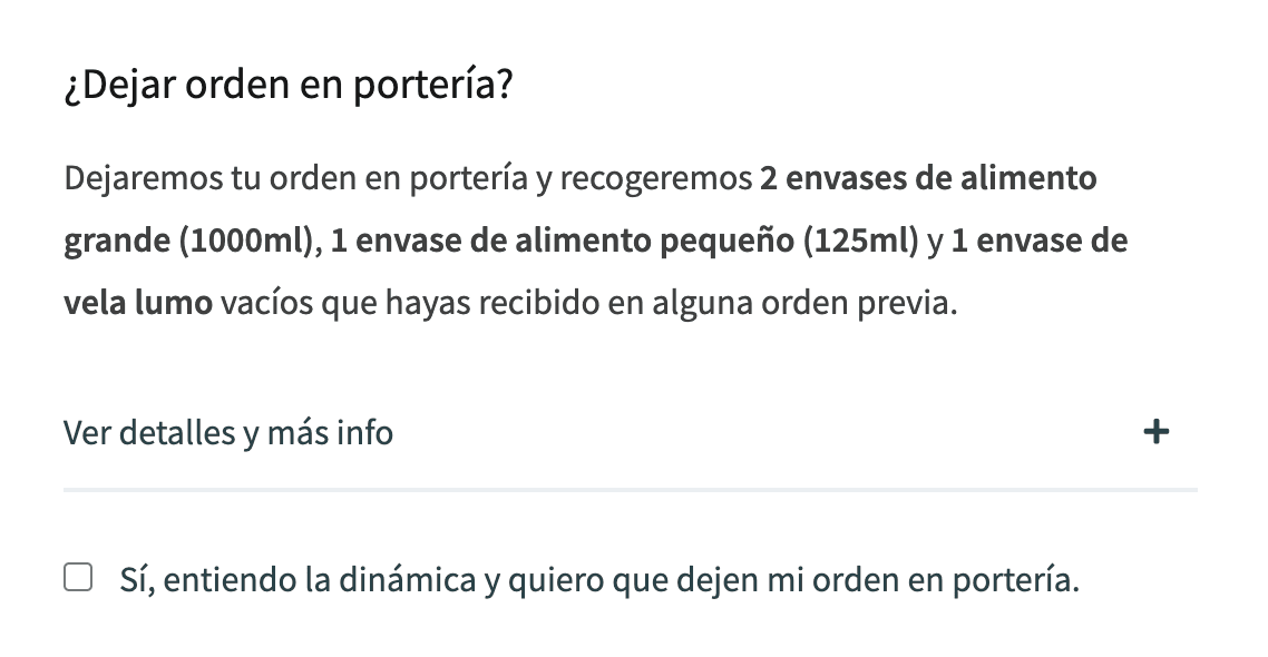
This is the option to leave the order at home reception at checkout with the summary of containers to return in a text format.
In case the customer wanted more details, we also provided a table with the containers summary (the number of containers to receive in the second colon, and the number of containers to return in the third column):
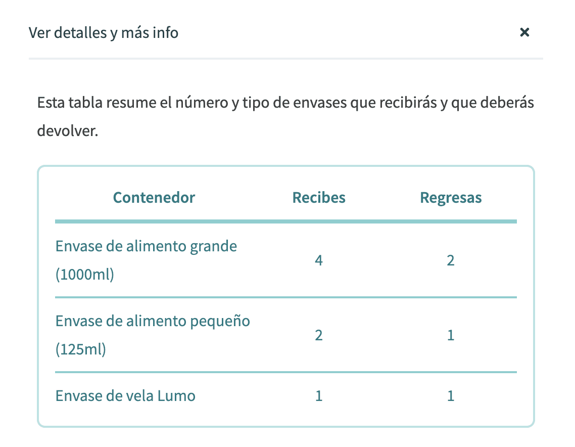
This is the summary of containers to return in a table format. It provides the specifics for each type of container.
Transparency was key to building trust and ensuring a smooth shopping experience, which is why we prioritized clear communication of the next steps after checkout.
This feature provided customers with concise, easy-to-follow instructions about what would happen next, including:
By keeping customers informed and eliminating uncertainty, we enhanced their confidence in the process.
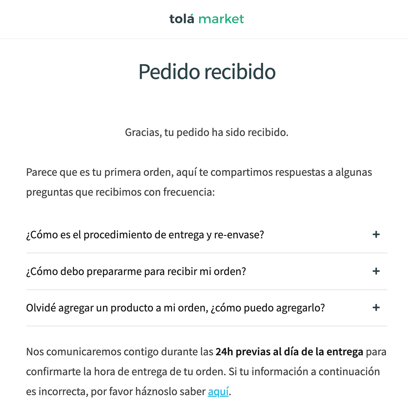
Information provided to the customer after placing an order. It includes frequently asked questions and expectations about the delivery.
Content is king. Well-crafted and targeted content will lead to customers and eventual promoters of a brand; we were always customer-oriented and with that in mind, we created a blog covering topics like sustainable living, veganism, and wellbeing.
This was the post layout which was rather simple, take a look at one of the latest blog posts published here:
To support the blog and the entire website, we developed a versatile catalog of custom components. Among them, the accordion stood out as one of the most used and effective tools. It provided a clean and interactive way to organize and present information, giving users a quick overview of the content on a page while allowing them to dive deeper into topics of interest. You can see the accordion in action here, where it enhances user experience by balancing simplicity with depth.
Tolá market was a monolith web application built with the good and old (but never out of fashion) WordPress, you may already have heard that it powers around 40% of all the websites on the internet.
It also has a huge support community and endless plugins to extend its core functionality. Thanks to that we were able to leverage crucial features such as payment gateways and e-commerce management.
These are some of the tools and technologies we used to improve and maintain the web application.
Development Tools
Since we had different products other than the web application, and some of those products had shared functionality, we had our code base in a mono repo structure, and we managed the mono repo using Nx.
We also used Webpack as bundler, Husky and GitHub actions in our pipelines, Jest for unit testing and ESLint and Prettier for code consistency.
Project Management & Collaboration
We had our source of truth and project management tool set up in Notion. I am still amazed by how flexible and powerful this tool can be, especially for being on the same page with the team and managing ongoing projects.
Backend
As WordPress is built with PHP and MySQL, we used lots of it to develop custom functionality for the backend of the web application.
I am a former JavaScript developer, and I was a bit resistant to learn and master PHP at the beginning, but PHP is a language that has improved a lot in recent years so after a while I started to like it.
Frontend
The frontend end was served by WordPress and interactivity was leveraged using TypeScript and jQuery (since it was already baked in with WordPress). We considered transitioning to more edge technologies like Next JS and React, but we never really saw the need for doing so. With the correct setup, WordPress gave us the speed and performance we wanted, besides, transitioning to a new technology would have been a huge investment in time and resources.
As for the styles, when we initially started the project we set up custom CSS classes utilities using SASS, and we used them to style the components in the UI. But as the team and project complexity grew, it was every time harder to improve and maintain such utilities, so we transitioned to TailwindCSS, which is quite robust, opinionated and most of us have had already worked with it.
Running a company is an unparalleled learning experience, offering lessons in technical skills, teamwork, strategic thinking, and more. Working at tolá market has been the greatest learning experience in my career. These are the main takeaways from leading the development of the web application:
Documentation and a source of truth are essential:
Simple things like how to run the project locally, how the project files are structured, or naming conventions, will remove the need of having a person explaining those things. It is not only important to have them set up, but also to build a culture that embraces documentation.
Set priorities: There will always be a pending tasks list:
As a developer, you might always want to improve the code, refactor it and make it more efficient, and this could easily become a never-ending task. But when defining what you and your team are going to work on, you need to have a bigger picture of the business, what are the current goals and current challenges? and how you and your team can contribute to those?
Validate ideas of solutions before you build:
Whenever you encounter a problem and come up with a solution, don't take that solution for granted, because if you do, you might pour all the effort and resources needed and once the “solution” is live (in production, for example), you may realize it has its pitfalls and you didn't take everything into account, thus, some of the work you invested might be an actual waste. This is part of the mindset of running a startup too.
It is always important to test and validate hypotheses incrementally before committing significant effort. This iterative approach minimizes risk, avoids unnecessary rework, and leads to solutions that truly address the problem at hand.